Desktop-First Redesign for B2B Technical Catalog
For a Swiss manufacturer, we rethought the information architecture, mega-menu, and advanced search to improve findability at scale while keeping the UI cohesive across languages, countries, and divisions.
- UX/UI Design
- Information Architecture
- Modular design
The Challenge: 6 Years of Content Growth Without Structure
The client, a Swiss leader in power supply and HMI solutions, faced a critical problem: their 6-year-old website had become unmanageable. As the company grew, content exploded: pages, products, priorities all shifted, but the information architecture couldn't keep up.
Sellers and dealers (primary users on Windows desktop) struggled to find CAD drawings, datasheets, and project info in the sprawling catalog. The old project management system no longer met stakeholder needs, and divisions felt disconnected despite being part of one company.
The result? A website that frustrated its most important users and failed to showcase the client's technical expertise effectively.

Discovery: Pain Points Across Sellers, Engineers, and Stakeholders
We analyzed Google Analytics, customer service data, stakeholder interviews, and user testing to map the real bottlenecks. Three key personas emerged: sellers/dealers (desktop CAD users), engineers (datasheet hunters), and internal stakeholders (content editors, marketing, management).
Key insights:
- Primary users rarely used mobile—desktop-first was non-negotiable for CAD/datasheet workflows
- Multi-language/multi-country needs created fragmented experiences (contacts, regulations vary by location)
- Content duplications, transitional pages, and poor findability slowed down expert users
- Divisions needed visual unity without losing their unique identities
- With hundreds of items, we prioritized an MVP for launch within months
A benchmark analysis set clear expectations: we needed best practices for B2B technical sites at global scale.
Reframing the Problem: Architecture First, Not Just Visual Refresh
The issue wasn't outdated visuals—it was structural chaos. Content had outgrown the original architecture, and no amount of styling would fix poor findability or disconnected divisions.
We took a co-design approach with stakeholders, iterating relentlessly to align complex requirements. Desktop-first became our guiding principle, but with mobile consistency for secondary users. The MVP focused on core structure: information architecture, mega-menu, search, and reusable modules to empower the client's internal maintenance team.
Our hypothesis: A rock-solid IA would unlock usability at scale, making everything else (visuals, features) fall into place.
UX Goals: Making Complex Catalogs Actually Work
- {{ goal.num }} {{ goal.text }}
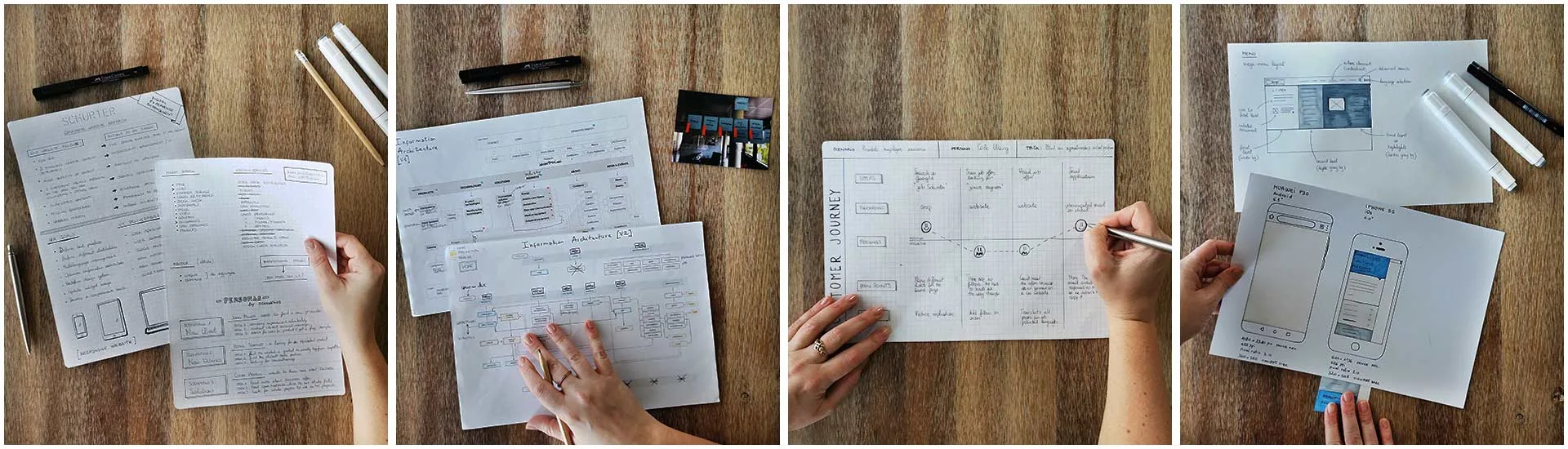
The MVP Package We Shipped to Unblock Launch
- {{ item }}
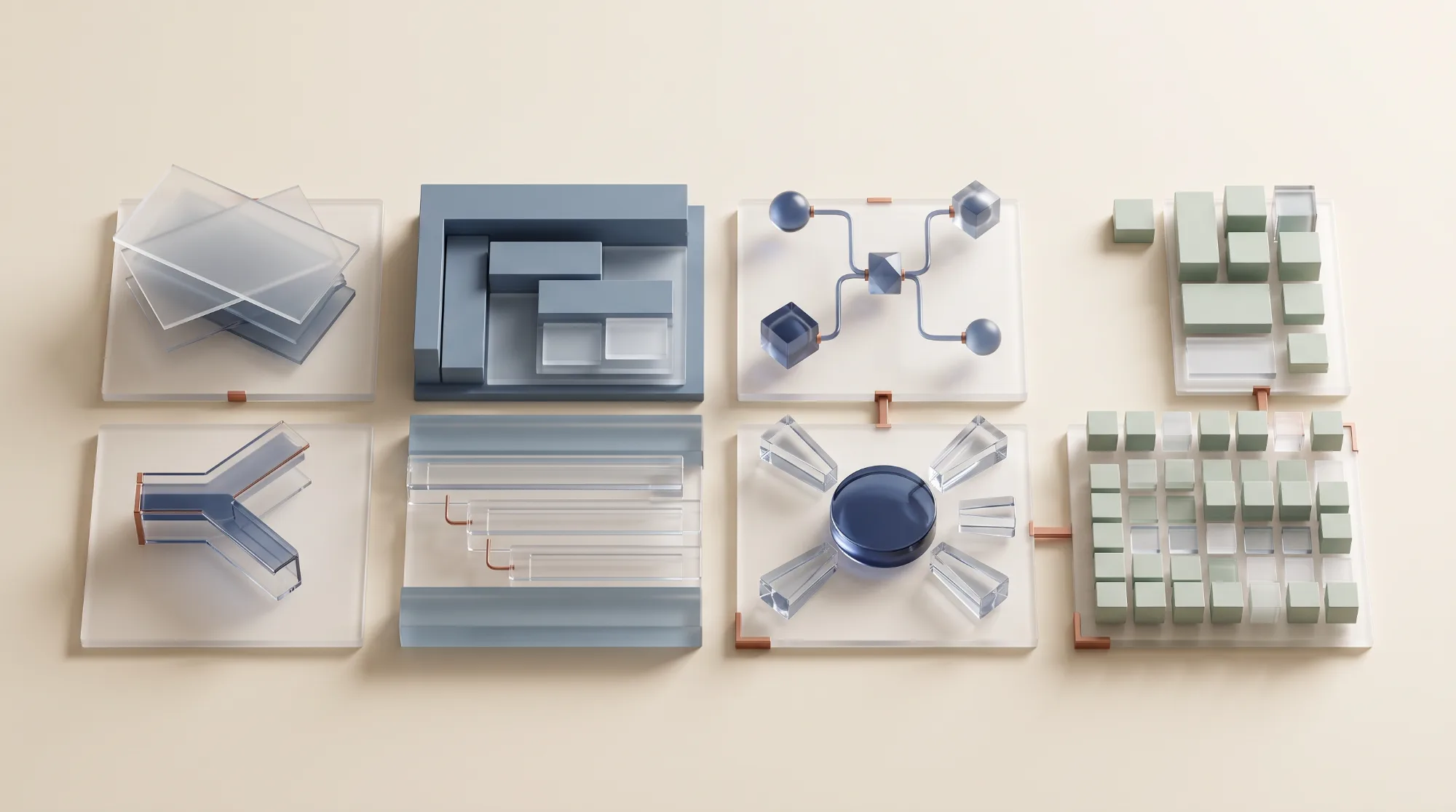
The Redesign: Mega-Menus, Advanced Search, Modular Scale
{{ block.title }}
{{ block.body }}
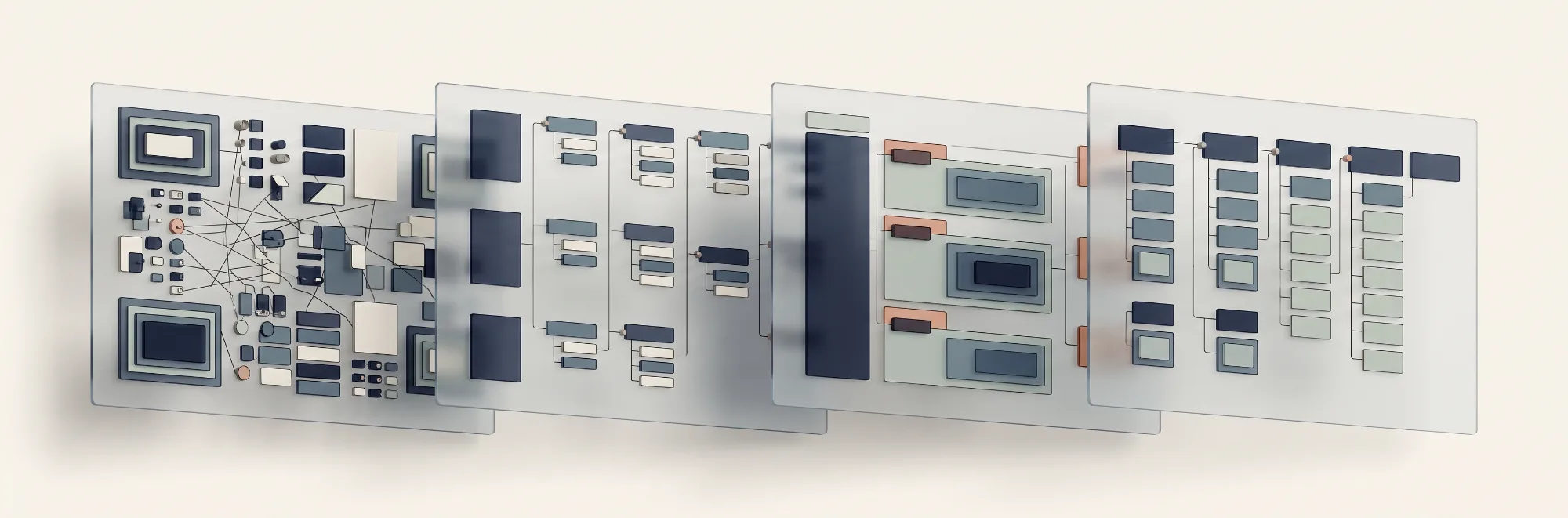
The Impact: MVP Launch with Scalable Foundation
We delivered the MVP—new information architecture, mega-menu, header, footer—on time, giving the client a website ready for rapid iteration.
Key outcomes
- Improved findability at scale for sellers navigating massive catalogs
- Unified brand experience across global divisions and languages
- Empowered internal teams with reusable modules and clear structure
- Desktop-optimized workflows for CAD/datasheet heavy users
The site continues to evolve with stakeholder-managed updates, proving the architecture's flexibility. Sellers, engineers, and marketers now have clear paths to what they need, regardless of their expertise level.
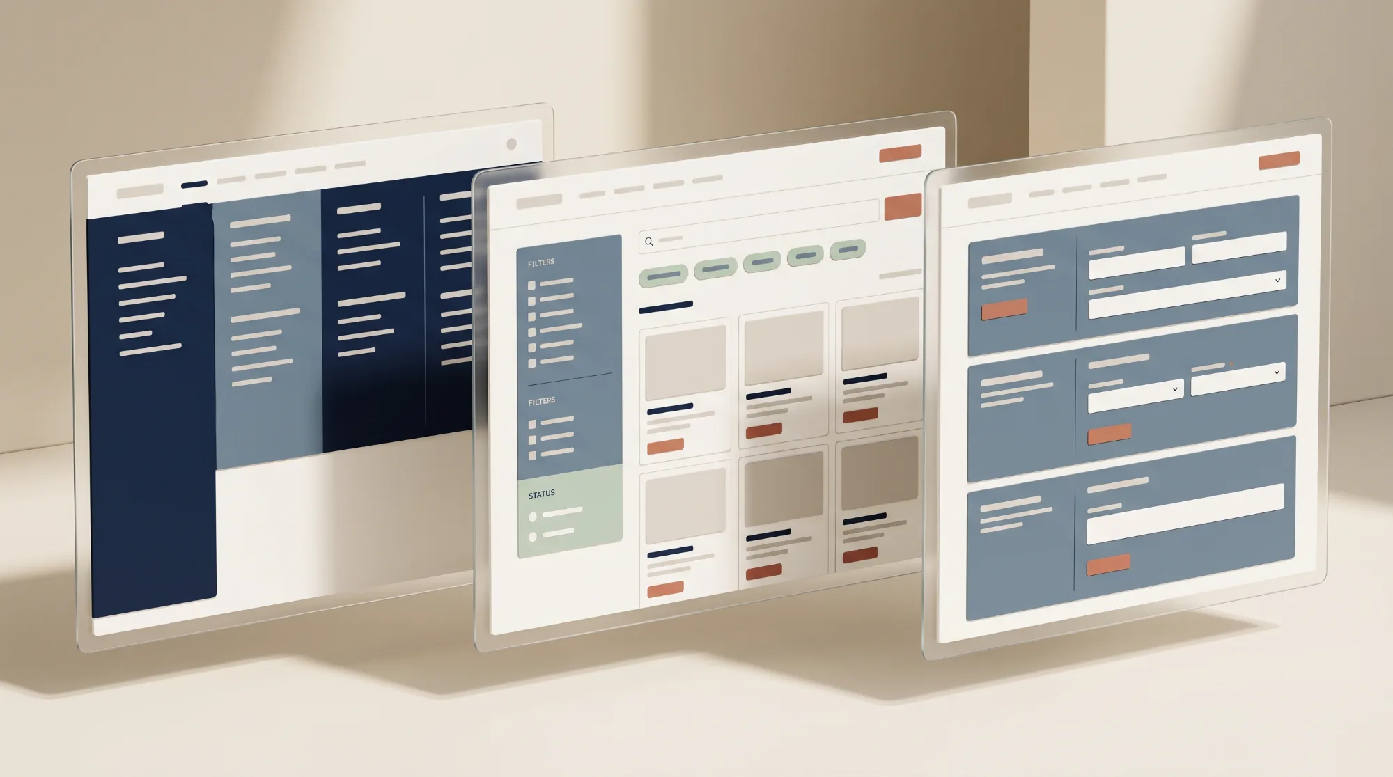
What This Taught Me: Co-Design Scales Complexity
The biggest challenge was balancing infinite stakeholders. Sellers needed speed, engineers needed precision, marketers needed visibility, editors needed simplicity. No single "primary user" existed—everyone was primary depending on the task.
The lesson: Relentless co-design with stakeholders + data-driven prioritization = architecture that serves everyone. By focusing on usability at scale over perfect visuals, we created a system that flexes as the client grows.
This project showed me that true information architecture isn't about organizing content—it's about organizing human needs across global complexity.
Working on something this tangled?
If your catalog, your architecture, or your search has outgrown its structure, let’s look at it together.