From Banking Complexity to Customer Clarity
A research-led redesign for a Swiss bank: user research, information architecture and accessible UX/UI for private, business and private banking customers.
- UX Researcher
- Information Architect
- UX/UI Designer
The Challenge: A Strong Website Outgrowing Its Structure
The bank already had a solid, sober and institutional website. It was one of the stronger examples among Swiss cantonal banks, with a clear brand presence and a large amount of product, service and document-based content.
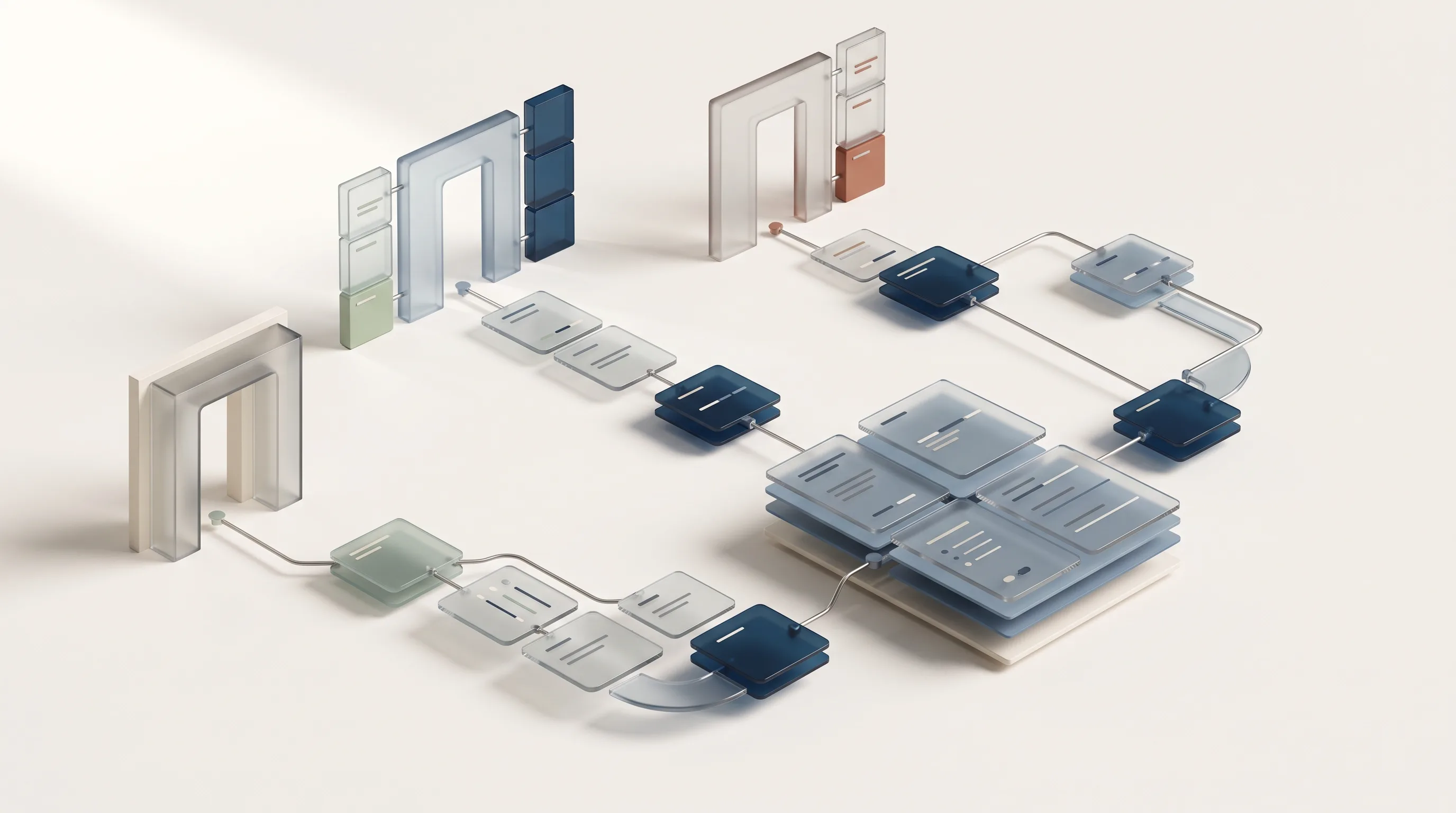
The challenge was that the website had grown over time into a dense ecosystem of approximately 110 pages. Content was not always easy to find, some pages offered too little context, and several journeys required users to understand the bank’s internal structure before they could understand where to go next.
The new website also needed to serve three different audiences: private customers, business customers and private banking customers. Each group required a relevant and premium entry point, while many products were shared between private and business users.
The challenge was not to fix a broken website. It was to make a strong institutional experience clearer, more accessible and more useful to the people using it.
My Role: From Presale Research to Product Design
I worked across the entire project, starting with the qualitative analysis developed during the presale phase and continuing through information architecture, wireframes, UI definition and development.
My roles were UX Researcher, Information Architect and UX/UI Designer.
I conducted five user interviews, contributed to a workshop with the client, created personas and customer journeys, and carried out a qualitative inspection of the existing website and e-banking experience.
I then translated the findings into the new sitemap, navigation logic, page structures and wireframes. Together with the graphic design team, I also worked on the new UI and supported the development of the public-facing website.
The e-banking analysis was conducted on a limited demo environment. My work on that part of the project therefore focused on identifying usability opportunities and structural issues, while the main design and development effort focused on the public website.
Deliverables: From User Evidence to a New Website
The project produced:
- User interviews, personas and customer journeys.
- Qualitative and heuristic analysis.
- Prioritisation of usability issues.
- Sitemap and information architecture.
- Navigation and mega-menu structure.
- Wireframes and page layouts.
- UI design with the graphic design team.
- Developed public-facing website.
The work covered the main website page types, including the homepage, audience-specific section pages, service pages, product pages, contact pages and transaction-oriented pages.
Discovery: Different Users, Different Definitions of Clarity
The research combined five user interviews, a client workshop and a scenario-based qualitative inspection. Instead of evaluating isolated screens, we followed users through realistic tasks such as logging in, finding investment information, monitoring transactions, setting up recurring payments and contacting support.
We created four personas representing private and business customers with different levels of digital and banking experience.
A young private customer needed help understanding investment and pension options. An experienced business user expected fast access to financial data and company services. Another private customer wanted to monitor spending and manage recurring payments, while an older user needed simple navigation and accessible support.
Across these different scenarios, the same pattern emerged: users usually knew what they wanted to achieve, but the interface did not always make the next step obvious.
The most relevant issues concerned
- Finding products, services and support.
- Understanding financial terminology and labels.
- Recognising the relationship between pages and sections.
- Accessing complete and coherent information.
- Navigating comfortably on mobile.
- Understanding the purpose and value of calls to action.
Reframing the Problem: The Structure Served the Bank Before the User
The website’s main issue was not a lack of content. It was the relationship between content, navigation and customer needs.
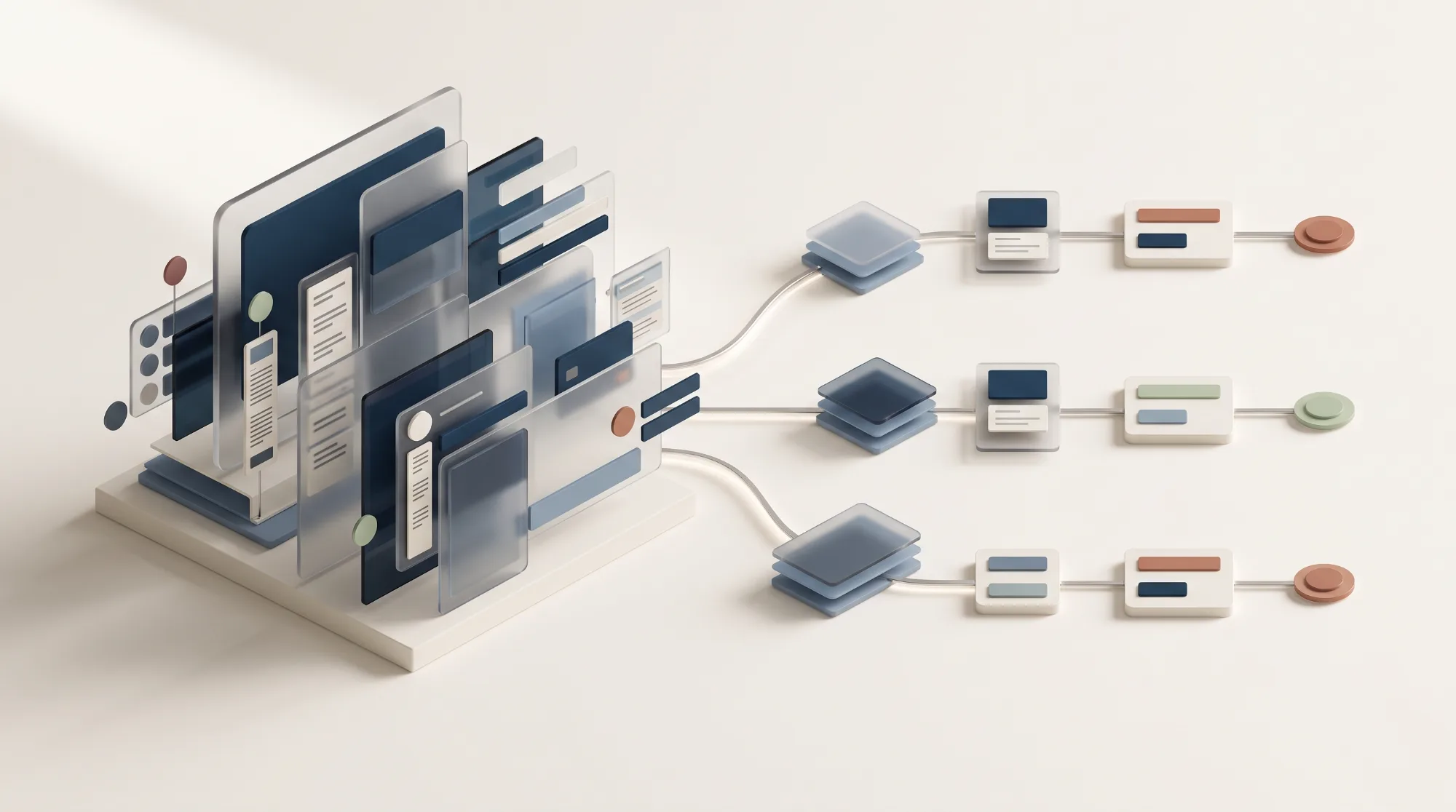
The existing structure reflected the way the bank organised its offering, but users approached it through goals such as opening an account, finding a mortgage, understanding an investment or getting help with a payment.
This became particularly challenging when designing for both private and business customers. Many products were relevant to both audiences, but duplicating pages would create SEO risks, additional maintenance and the possibility of inconsistent information.
A single shared page would be easier to maintain and more effective for SEO, but it needed to provide enough context for both target groups without becoming overloaded.
The information architecture had to balance three things at once: user clarity, content governance and search visibility.
UX Goals: Make Banking Easier to Find and Understand
The new experience needed to:
- {{ goal.num }} {{ goal.text }}
Process: Research, Structure, Design
Understanding the existing ecosystem
We began by analysing the public website and the available e-banking demo. The public site contained around 110 pages across six main sections, while the e-banking environment had separate private and business interfaces that were not fully available for review.
The initial analysis was qualitative because quantitative analytics were not available at that stage. We used personas, scenarios and user journeys to identify the most relevant usability and structural issues.
Prioritising what mattered most
The issues were organised according to frequency, severity and importance. This helped distinguish between minor interruptions and problems that could seriously affect a user’s ability to complete a task.
The recurring themes were incomplete information, unclear labels, weak visual hierarchy, fragmented navigation and limited guidance.
Exploring the architecture options
The most complex architectural question concerned products shared by private and business customers.
We compared different models: separate pages for each audience, shared pages with target-specific sections, and flatter repositories for products and services.
Designing the new website
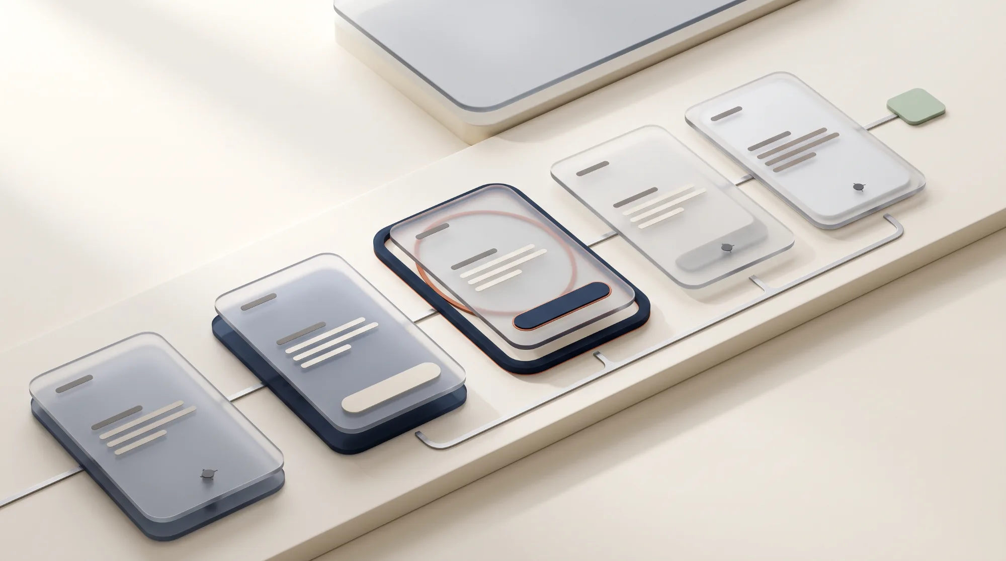
Once the structure and navigation logic were defined, I worked on the wireframes and page layouts. The graphic design team then translated these into the new UI, preserving the bank’s sober and institutional identity while introducing a more contemporary visual experience.
The final design direction used richer content hierarchy, clearer product communication and more deliberate calls to action to help users understand what each page offered and what they could do next.
The trade-offs behind the decision
The decision was not purely an IA exercise. Each option had consequences for:
Making these trade-offs explicit helped us define a structure that was realistic for both users and the bank’s content team.
- The user journey.
- SEO and content duplication.
- Editorial effort.
- Future maintenance.
- Flexibility of product storytelling.
The Solution: Three Entry Points, One Coherent Experience
Audience-specific section pages
The new structure created three strong entry points for private customers, business customers and private banking customers.
Each section could act as a focused starting point, with content and storytelling tailored to the audience while remaining part of the wider bank ecosystem.
A mega-menu that explains the structure
We worked on the mega-menu as both a navigation and communication tool.
The proposed structure made it clearer what users could expect from each category, whether a menu item opened a submenu or led directly to a page, and where different products and services belonged.
The client later made changes to the mega-menu, so the live version does not perfectly reflect the original design direction.
Shared products without duplicated pages
For products relevant to both private and business users, we explored shared pages with clearly separated target-specific sections.
Anchor-based access allowed users to arrive directly at the relevant part of a page from their chosen navigation path, while keeping the underlying product information consolidated.
This reduced duplication and made the content easier to maintain, without preventing different audiences from reaching the information most relevant to them.
Accessibility built into the experience
Accessibility was treated as a requirement of the system rather than a final check.
The design work considered readability, contrast, content hierarchy, interaction clarity, mobile navigation and WCAG 2.2 AA requirements throughout the project.
Product pages with clearer next steps
The product pages were redesigned to answer essential user questions:
- What is this product?
- Who is it for?
- Why might it be useful?
- What do I need to know?
- What can I do next?
This meant reviewing both the page structure and the product copy. The aim was to make financial information more understandable without removing the precision required by the subject matter.
The Outcome: A Clearer Foundation for Three Audiences
The project evolved from a presale UX analysis into the architecture, design and development of the bank’s public website.
The final outcome included
- A new information architecture.
- Clearer entry points for three customer audiences.
- A redesigned navigation and mega-menu concept.
- More focused product and service pages.
- Stronger content hierarchy and calls to action.
- A more accessible and responsive design direction.
- A developed public-facing website, now live.
The live website has since been edited by the client, particularly in the mega-menu, so it does not perfectly reflect every detail of the original design work.
The value of the project was connecting research, architecture, content, accessibility and visual design into one clearer foundation for the bank’s digital experience.
What This Taught Me: Clarity Builds Trust
Financial websites ask users to make decisions that can feel personal, complex and high-stakes. In that context, clear navigation and understandable content are not just usability improvements. They help people feel more confident.
The most challenging part was creating a structure that could serve three distinct audiences without duplicating shared products or compromising content maintenance and SEO.
This project reinforced the importance of treating information architecture as a strategic activity. It is not only about deciding where pages belong. It is about deciding how an organisation presents its offering, how users understand it and how easily they can take the next step.
Good banking UX does not make the institution feel smaller. It makes the user’s next step feel simpler.
Need to make a complex offering easier to understand?
Let’s connect research, architecture and accessible design into one clearer experience.